In 1502, Albrecht Dürer sat down and painted a hare. Not a mythological beast, not a symbol of Easter abundance, not the companion of a saint. Just a young hare, sitting alert, rendered with what he called “infinitesimal strokes”: short, choppy brushwork around the ears, long curving strokes along the flanks, a barely visible reflection of his studio window caught in the animal’s eye. The painting is watercolor and gouache, 25 centimeters tall. It has been reproduced so many times that the original, housed in Vienna, is only displayed to the public once every few years to protect it from light exposure.
Dürer did not invent animal portraiture. But he demonstrated something that is still true five centuries later: the style you choose for an animal subject is not decoration. It is argument. It says something specific about what you believe the animal is, what it means to you, and how you want other people to see it.
That argument becomes more interesting, and more personal, when the animal is yours.
What “Style” Actually Does
Before getting into the individual options, it is worth being specific about what an art style actually controls. Three things, mostly.
First, texture. Oil paint in glazed layers produces a depth and density that looks physically substantial. Watercolor, because it works by allowing white paper to show through translucent pigment, produces luminosity. Pencil sketch produces structure without color, which the eye reads as precision and restraint. Pop art uses flat planes of color with strong outlines, which strips away texture in favor of graphic impact.
Second, emotional register. The Flemish masters who perfected oil glazing in the 1400s built a technique that, in Jan van Eyck’s hands, gave every surface a kind of inner light. That technique became the grammar of formal portraiture for four hundred years. When you commission an oil portrait, you are invoking a visual tradition associated with gravity, significance, permanence. Watercolor carries a different set of associations: informal, warm, personal, suggestive rather than definitive. These are not arbitrary. They come from a long history of how each medium has been used.
Third, what the medium is actually good at. Watercolor cannot produce the deep, saturated shadows that oil can. Oil cannot, by its nature, produce the soft luminous edges that watercolor achieves by letting pigment bleed into wet paper. Pencil sketch cannot hold color. Pop art cannot hold nuance. Each style has genuine technical strengths and genuine limitations, and the portrait you get will reflect both.
So the practical question is: which style’s strengths match what you actually want?
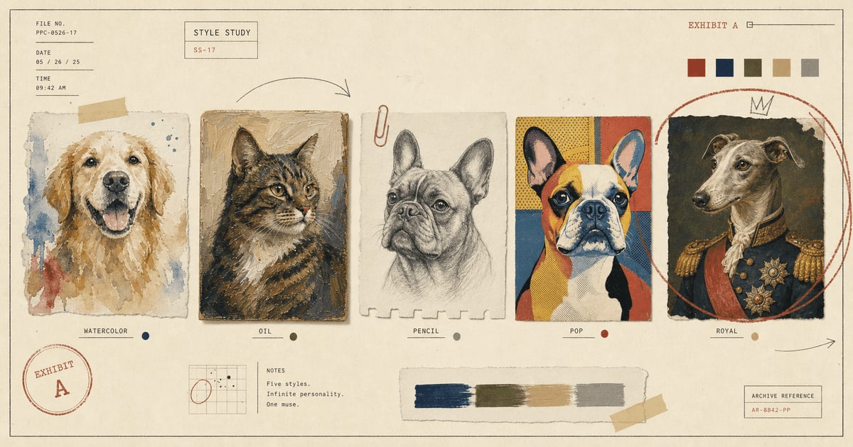
Watercolor: Where Fur Becomes Light
Watercolor’s particular gift for animal subjects is this: it handles softness as a formal property, not a sentiment. A skilled watercolor artist does not make a golden retriever look soft by being gentle with the brush. They do it by controlling the amount of water, the absorbency of the paper, and the timing of each wash, so that edges dissolve where fur dissolves and sharpen where the eye needs to land.
J.M.W. Turner, who became the most celebrated watercolorist in English history, developed a technique of soaking paper first, then applying warm and cool washes in sequence, letting them bleed and interact before adding detail on the dried surface. The result was a kind of organized atmospheric blur: specific in some places, evocative in others. Turner used this for landscapes. The same principle works very well for animal fur, because real fur is not a uniform surface. It catches light in some places, falls into shadow in others, and in many places does both simultaneously.
This is why watercolor suits fluffy breeds so naturally. The medium’s tendency toward soft edges is not a compromise; it is an accurate description of what a long coat actually looks like when light hits it. For a Samoyed, a Maine Coon, a golden retriever, a ragdoll cat, watercolor renders the coat truthfully rather than just decoratively.
It also suits memorial portraits for a different reason. The softness and luminosity of watercolor carry a certain gentleness without requiring you to signal that gentleness. The portrait can feel peaceful without performing it.
Where watercolor shows its limitations: very dark coats, high-contrast markings, and subjects where the drama is in the depth of shadow. A black Labrador in watercolor can look flat, because watercolor builds from light rather than dark, and a coat that is almost entirely dark has very little room for the medium’s strengths.
Oil Painting: Where Weight Becomes Presence
The Flemish oil technique, refined by Jan van Eyck and later mastered by Rembrandt and Velázquez, works through layering. Transparent glazes are applied over an opaque underpainting, each layer shifting the color slightly, building up what painters call optical depth: color that seems to exist inside the surface rather than sitting on top of it. It is this quality that makes oil portraits feel three-dimensional even when you know they are flat. The light enters the paint, bounces off the underpainting, and returns to the eye through the glazes. It is, technically, a form of luminosity. Just a different kind than watercolor.
For animal portraiture, this depth does particular things. Dark coats, which flatten in watercolor, become rich and dimensional in oil. A black Labrador can look like what it actually is: not a void, but a coat with subtle variations of brown and blue and gray that the eye reads as depth. A husky’s bicolored markings can be painted with the same care that Flemish masters gave to velvet and silk.
Oil also handles eyes differently than any other medium. The glazing technique allows for layers of transparent color over opaque highlights, producing an iris that looks genuinely lit from within. This matters more than it sounds. In a portrait, the eyes are the primary location where the viewer decides whether the likeness is correct and whether the animal feels present.
The cultural associations of oil are part of the argument too. Sir Edwin Landseer, who was Victoria and Albert’s preferred painter, built a career on giving dogs the same gravity that oil portraiture had previously reserved for people. His Newfoundlands, spaniels, and greyhounds were painted with the compositional weight and technical seriousness of official portraits. The effect was sometimes comic in a way Landseer probably did not intend (a dog rendered with the solemnity of a duke has inherent absurdity). But it also made a genuine argument that these animals deserved to be taken seriously, which is, in various ways, what every pet portrait is still arguing.
Oil works best for: large dogs with strong bone structure, dark coats with subtle variation, pets with a naturally serious or regal expression, portraits intended for formal spaces, and any situation where the comedy of excessive seriousness is exactly what you want.
Pencil Sketch: Precision Without Comment
There is a version of pencil sketch that exists purely as a more affordable alternative to painting. That version is not interesting. The version that is interesting uses line and value, without color, to make a visual argument about structure that color would actually obscure.
Dürer’s Young Hare uses cross-hatching to build fur texture through directionality: the strokes follow the hair, so the eye reads them as hair. The same logic applies in portrait work. A pencil sketch of a wire fox terrier, done well, uses line direction and weight to describe coat texture more precisely than a painting could. The drawing does not pretend to show color; instead, it shows everything else. The planes of the skull beneath the coat. The way the beard grows. The exact angle of the ears.
This makes pencil sketch particularly strong for breeds with visible bone structure, wiry or curly coats where texture is the story, or subjects where the expression is very specific. Poodles, schnauzers, terriers, greyhounds, Siamese cats, and tabby cats with strong facial markings are all subjects where the elimination of color focuses attention productively.
The sketched portrait also carries a different emotional weight than painted work. It reads as observational, as if someone sat down and looked closely at this specific animal. In rooms with minimal color, natural materials, and calm walls, a pencil portrait integrates in a way that a brightly colored painting does not.
Pop Art: When the Pet Is the Event
Andy Warhol’s Marilyn, his Mao, his Coca-Cola bottles, his dollar signs: they all operate on the same principle. Take a recognizable image. Reduce it to its most essential shapes. Apply flat, saturated, graphic color. The result is immediately readable from across a room, because it has been stripped of everything that isn’t the essential.
Applied to a French bulldog or a pug, this is, objectively, correct. French bulldogs have bat ears, round eyes, a compact face with distinct planes, and an expression that can be read at ten feet. Pop art does not have to simplify much. The animal is already a graphic.
The limitation is precision. Pop art rewards strong shapes and high contrast. A dog with subtle coat gradations, a face that depends on careful light, or an expression that is fundamentally quiet will not be well-served by a medium that eliminates nuance. Pop art says “this animal is an event, a statement, a thing of visual force.” That is true for some pets. It is true, perhaps especially, when the pet in question is a nine-pound brindle dog who has conquered the household by force of personality alone.
Surrealist: The Ruff and the Reasonably Serious Brushwork
The surrealist style in pet portraiture works through deliberate anachronism. Your Labrador is placed in a Tudor setting with a velvet ruff, painted in the manner of Hans Holbein. Your cat is depicted receiving courtiers. Your terrier is rendered with the compositional gravity of a seventeenth-century equestrian portrait.
The joke, such as it is, requires genuine craft to land. If the brushwork is lazy or the composition is casual, the result is just a novelty item. When the painting technique is actually serious, the contrast between the subject (a dog in a ruff) and the treatment (painstaking realism, dramatic chiaroscuro lighting) produces something that functions both as comedy and as art. The viewer laughs first. The viewer then notices that the portrait is, technically, quite good. The viewer then feels something, because the portrait was made with obvious care about an animal someone actually loves.
This is the strongest gift style for exactly this reason. It requires knowing your audience, because not everyone wants their pet rendered in baroque costume. When it’s right, it’s very right.
Making the Choice
Most of the advice you’ll find online about choosing an art style for a pet portrait focuses on the pet’s physical characteristics: fluffy breeds get watercolor, large breeds get oil. That is a useful start. But it misses the more important variable, which is emotional register.
The question is not just “what does my dog look like?” It is “what do I want to feel when I look at this portrait in five years?” Watercolor tends toward warmth and memory. Oil tends toward significance and presence. Pencil sketch tends toward attention and observation. Pop art tends toward celebration and humor. Surrealist tends toward love made theatrical.
The style you choose is not a setting. It is a statement about what this particular animal means to you. Dürer did not paint the Young Hare because it was an exceptional hare. He painted it the way he painted it because he wanted to demonstrate something about what close attention to an ordinary creature could produce. Every pet portrait, at whatever scale and in whatever medium, is working in that same tradition.
Every portrait at Pet on Canvas starts at $24.99 for a digital file, with custom canvases from $49.99. If you are genuinely unsure which style fits your pet, include a few words in your order notes about the personality and the room: “affectionate but imperious” and “modern apartment with white walls” will get you further than trying to pick from a menu blind. Custom work, one portrait at a time. Start here.
Sources
- Galleryintell, “Young Hare by Albrecht Dürer”: https://galleryintell.com/artex/young-hare-durer/
- Wikipedia, “Young Hare”: https://en.wikipedia.org/wiki/Young_Hare
- The Wallace Collection, “Turner’s Watercolour Materials and Techniques”: https://www.wallacecollection.org/explore/explore-in-depth/turner/turners-watercolors/turners-watercolour-materials-and-techniques/
- National Gallery of Art, “Who Is Sir Edwin Landseer?”: https://www.nga.gov/stories/articles/who-sir-edwin-landseer-10-things-know
- Old Masters Academy, “How to Paint Using the Flemish Method”: https://oldmasters.academy/old-masters-academy-art-lessons/how-to-paint-using-the-flemish-method-glazing-skin-tones-over-dead-layer
Welcome perk
Free expedited delivery on your first portrait
Get your digital proof in 1-2 business days instead of 2-3, free on your first portrait. Normally a $10 upgrade.
No spam. Just the perk and the occasional new style or guide.
Check your inbox for your code.