Sir Edwin Landseer painted Queen Victoria’s dogs. He painted Prince Albert’s greyhound, Eos, with the compositional gravity reserved in that era for official portraits of minor nobles. He painted a Newfoundland named Bob in a piece called “A Distinguished Member of the Humane Society” (1838), the title given with apparent sincerity, as though Bob had earned a fellowship through distinguished service, which, to be fair, he had: Newfoundlands at the time were working rescue dogs at London’s docks. Landseer was so consistently associated with a particular black-and-white variant of the Newfoundland that the coloring was named after him. Landseer dogs. The artist became the breed adjective.
The breed hierarchy in Victorian painting was not arbitrary. Greyhounds were painted because they were graceful and their bone structure was readable even at a distance. Spaniels appeared constantly because they were the companions of royalty and the aristocracy, and the paintings were commissions from owners who wanted their dogs recorded with the same fidelity they wanted their children recorded. Newfoundlands got Landseer’s best work because they were large, dark-coated, compositionally powerful, and, in his hands, carried a moral argument about animal nobility that the Victorian public responded to with unusual intensity.
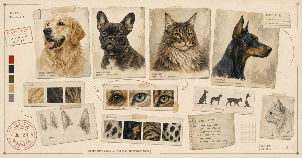
The point is: the breeds that dominated portraiture historically were the ones that offered something useful to the painter. Strong bone structure. Coat texture that rewarded close attention. A face with enough planes to catch light and shadow meaningfully. Markings that gave the composition inherent structure. These technical properties have not changed. They are just as relevant now.
What Makes a Breed Paintable
Before going through specific breeds, it helps to name the variables painters actually work with. There are four.
Coat value range. How far apart are the lightest and darkest areas of the coat? A Dalmatian and a tuxedo cat have very high contrast, which gives the painter a ready-made composition. A solid mid-grey Weimaraner has a narrow value range, which requires the painter to build all the visual interest from subtler means. Neither is harder to paint well, but they are differently challenging.
Facial legibility. Portrait painting depends on the face being readable as a face: distinct features, eyes that can be clearly located and rendered, muzzle structure that has visible planes and angles. A flat-faced breed, like a Persian or a pug, has high facial legibility because the features are compact and distinct. A breed with a long, narrow muzzle, like a Greyhound, has legibility of a different kind: the bone structure is prominent, the profile is dramatic, but the face is less immediately expressive in photographs.
Coat texture. An animal with a coat that has visible texture, distinct curl patterns, layered fur with visible undercoat, wiry hair that grows in specific directions, gives the artist something to work with. Texture creates surface interest. A smooth-coated dog is not harder to paint, but a curly-coated dog, handled well, rewards close looking in a way that smooth coats do not.
Expressive default. Some breeds, through facial structure, simply tend to look more expressive in photographs. This is not personality. A Labrador is not actually more emotionally complex than a Sighthound. But the Lab’s face, with its broad forehead, prominent eyes, and slightly rounded skull, produces more readable expressions in a two-dimensional photograph. The Sighthound’s long narrow profile and smaller eye relative to skull size produces a different kind of image: more profile, more silhouette, more formal.
Golden Retrievers, Labradors, and the Professional Sweethearts
Golden retrievers and Labrador retrievers dominate portrait commissions not because they are the most visually complex subjects, but because the face does an enormous amount of work before the artist begins. The broad skull, large forward-facing eyes, and soft ear carriage produce an expression that reads as warmth and attention. The golden’s coat, layered and directional, feathers at the edges in a way that translates beautifully to watercolor. The Labrador’s smooth, dense coat, especially in black, is one of the better arguments for oil painting: the dark coat has enormous value range in the right light, with near-black shadow areas and warm brown midtones that require the layering capacity of oil to render with any depth.
Both breeds were bred as working retrievers: patient, attentive, oriented toward the human. That behavioral quality does something to how they sit for photographs. They tend to look at you. The eye contact produces a portrait with a different quality than animals who do not orient toward the camera.
French Bulldogs, Pugs, and Boston Terriers
The flat-faced breeds (brachycephalic, in the technical term) have faces designed, through generations of breeding, to be maximally legible in the front plane. The features are compact, close together, and prominent: large round eyes, a dramatically foreshortened muzzle, prominent bat ears in the Frenchie’s case. At small canvas sizes this reads immediately. At large canvas sizes it becomes almost monumental.
Pop art is the obvious treatment and for good reason. Warhol’s technique of reducing an image to its essential shapes and applying graphic color works best when the subject already has bold, readable forms. A French bulldog is essentially already a graphic. The bat ears, the round eyes, and the square muzzle divide the face into clean geometric zones. You are not simplifying; you are translating.
Oil painting works here too, specifically because of the contrast: the absolute seriousness of the Old Masters technique applied to a creature whose expression is, intrinsically, slightly funny. This was Landseer’s move, and it still works. The comedy is in the gap between the gravity of the treatment and the charisma of the subject. The portait is sincere. The subject is a nine-pound dog with opinions.
German Shepherds, Dobermans, Huskies
These breeds reward large formats and serious treatment because the face carries more planes and angles than the soft-skulled breeds. A German shepherd’s head has visible bone structure: the zygomatic arch, the slightly wedge-shaped skull, the prominent stop. In good light, these planes catch differently, producing a natural chiaroscuro that oil painting is built to handle. The erect ears also give the portrait a vertical energy that conveys alertness even in a static image.
Huskies bring the additional variable of coat pattern. The typical husky face mask, with its contrasting colors and the eyebrow markings that produce an expression of perpetual mild skepticism, is pre-composed. The artist does not need to create visual interest; the coat arrangement has already done it. The challenge is handling the contrast well: the very dark areas of the mask against the pale muzzle and the often vivid eye color. Oil handles this better than most media.
Pencil sketch works for these breeds in a different way. The structural detail that oil renders through color and value, a skilled pencil drawing renders through line weight and directionality. The planes of a German shepherd’s skull, drawn in graphite, can be more architecturally clear than they are in a painting precisely because the absence of color forces the eye to read the structure.
Poodles, Doodles, Schnauzers, and Terriers
The curly and wiry-coated breeds are texture problems, in the best possible sense. A standard poodle’s continental clip, with its deliberately structured coat arrangement, is one of the more compositionally deliberate things in the animal world. A schnauzer’s beard and eyebrows are distinct enough to read as expressive features in their own right. A wire fox terrier’s coat has directionality: the wiry hairs grow at specific angles that give the surface a visible structure.
Pencil sketch handles wire and wiry coats exceptionally well because the medium’s basic mark (a directional line) is formally analogous to the basic unit of the coat (a directional hair). You can build a schnauzer’s beard from pencil strokes that are essentially doing the same work as the hairs. The result is a portrait that feels observed rather than rendered.
Watercolor works for curly coats, particularly doodles and poodles, when the goal is softness and charm. The medium’s natural tendency toward soft edges is at home with a coat that does not have hard perimeters. The challenge, and it is a real one, is photo quality. Curly coats in bad light turn into vague dark masses. Get close, use window light, and make sure the individual curl structure is visible in the photograph before ordering. If the artist cannot see the curls in the reference, the portrait will read as a generic fluffy dog rather than the specific dog you live with.
Maine Coons, Persians, and the Long-Haired Cats
These cats arrive at a portrait with a compositional structure already solved: a small, distinct face surrounded by an elaborate ruff of fur that frames it like a frame. The challenge for the artist is not composition; it is scale and texture. Long-haired cat portraits need enough canvas to let the fur be fur rather than a smear. Too small, and the layered coat becomes illegible.
Watercolor handles the ruff particularly well because the medium can render the outer edges of the fur as lost edges: the fur does not end, it disperses into the background. This is technically accurate. It is also formally elegant. The face is sharp and specific; the outer fur is atmospheric. The contrast between these two zones gives the portrait depth and life.
Maine Coons additionally have the advantage of being large: a mature Maine Coon’s face, at 18x24 inches, has something close to the compositional presence of a dog portrait. Their coat is also directional, with visible layering and a distinct ruff, throat mane, and ear furnishings that give the portrait multiple zones of textural interest.
Siamese, Sphynx, Bengals, Tuxedo Cats
High-contrast and unusual cats present a different set of gifts. Siamese cats have one of the most recognizable color patterns in the domestic cat world: the dark “points” on face, ears, paws, and tail against a pale warm body, with often striking blue eyes. This color arrangement is essentially self-composing. The face is framed by the dark mask; the eyes pop against it. Oil painting handles the contrast between the dark points and the warm body particularly well because of the medium’s capacity for rich dark values that are not simply black.
Sphynx cats, which are hairless or nearly so, present the opposite texture challenge: instead of fur, you have bare skin with visible muscle structure and often striking wrinkle patterns. Caravaggio painted figures with this quality of skin: the light and shadow move across a surface that has no fur to diffuse them. Oil painting is the natural home for a Sphynx because the glazing technique was invented for exactly this kind of subtle tonal modeling.
Bengal cats are essentially a graphic design argument: rosette markings, often very high contrast, with a coat that catches light distinctively. Pop art and oil both work, for different reasons. Pop art because the markings are already graphic. Oil because the actual coat color of a well-bred Bengal, with its gold and brown and near-black, has a richness that rewards layered paint.
Mixed Breeds and the Specificity Argument
Landseer painted pure breeds because that was what was commissioned. The Newfoundland “Bob” was notable partly because he was a recognized breed doing recognizable breed work: water rescue. The portrait was an argument about the category as much as the individual.
The argument for mixed breeds is the opposite. A mixed-breed dog does not represent a type. It is an individual, which is exactly the thing a portrait is built to record. One ear up, one ear down, a coat that is part retriever and part mystery, a face that only makes sense when you know the dog. These are not limitations. They are the specific visual content of a specific life.
The interesting technical challenge with mixed breeds is that the artist cannot rely on breed-typical features to shorthand the rendering. They have to look more carefully at what is actually in front of them. This is, arguably, what a portrait should always require. The breeds are useful shortcuts. They are not the point.
The Photo Still Matters More Than the Breed
Everything here is a tendency, not a rule. A bad reference photo of a Norwegian Forest Cat will produce a worse portrait than a superb reference photo of an average mixed breed. The breed provides some built-in compositional advantages. The photograph provides the actual visual information from which the portrait is made.
Clear, well-lit, eye-level, eyes sharp: these remain the standard. Window light, mid-morning or mid-afternoon, camera at eye level with the pet, close enough that the face fills most of the frame. Everything else, the breed, the style, the notes, follows from that.
Browse breed portrait examples in the portfolio, or start your order when you have a photo that makes you think: yes, that is them.
Sources
- National Gallery of Art, “Who Is Sir Edwin Landseer?”: https://www.nga.gov/stories/articles/who-sir-edwin-landseer-10-things-know
- Art UK, “Art gone to the dogs: canine portraiture in modern Britain”: https://artuk.org/discover/stories/art-gone-to-the-dogs-canine-portraiture-in-modern-britain
- Wikipedia, “Edwin Landseer”: https://en.wikipedia.org/wiki/Edwin_Landseer
- The Newfoundland website, “The Newfoundland Dog as captured by Sir Edwin Landseer”: https://www.thenewfoundland.org/landseer.html
Welcome perk
Free expedited delivery on your first portrait
Get your digital proof in 1-2 business days instead of 2-3, free on your first portrait. Normally a $10 upgrade.
No spam. Just the perk and the occasional new style or guide.
Check your inbox for your code.