For most of Western portrait history, the background was a deliberate signal. When Hans Holbein painted Henry VIII against a flat architectural background, the choice was not neutral. When Vermeer’s subjects appeared in rooms filled with specific objects, the objects were there on purpose. When Van Dyck placed aristocrats in front of stormy skies and curtains, the drama of the setting was part of what was being communicated about the subject. Portraits were expensive, permanent, and politically significant enough that nobody got background decisions wrong by accident.
Pet portraits are smaller in historical consequence. But the perceptual mechanics are the same, and ignoring them produces the same problems it always has: a subject that competes with its setting, a composition that does not know what it is about, and a piece of art that makes viewers slightly uneasy without knowing why.
The background is never nothing. Even a blank expanse of warm cream is a choice with visual and emotional consequences. Understanding those consequences takes about five minutes, and it will make your portrait decision considerably more confident.
Subject and Ground: The Fundamental Problem
Visual perception works by distinguishing figure from ground: the object of attention from the space around it. This distinction is automatic, involuntary, and governed by a set of perceptual principles that psychologists have studied since Gestalt theory in the early 20th century. Your visual system is doing it right now as you read this sentence, separating the letters from the page.
In portrait painting, the figure is the subject, usually the face and head, and the ground is everything behind them. The basic requirement is that the viewer’s eye should be able to read the figure clearly and should not have to compete with the ground for attention. When this works, the portrait feels immediate: you see the animal first, fully, and the background recedes. When this fails, the composition feels restless or ambiguous, and viewers may not be able to identify why they find the portrait less satisfying.
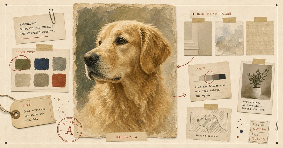
The main tools for achieving good figure-ground separation are contrast (value, color, and edge), simplicity, and visual weight. A dark subject against a light background separates clearly. A light subject against a dark background can work if the edges are handled carefully. A mid-value subject against a mid-value background in a similar color is asking the viewer to do work that the artist should have done.
This is why advice about backgrounds almost always emphasizes contrast, not because contrast is aesthetically superior, but because it is perceptually functional. A portrait where the subject is hard to read is a portrait that has not done its job, regardless of how sophisticated the brushwork is.
What Color Does
Color has three independent dimensions that matter separately in this context: hue (what color), saturation (how intense), and value (how light or dark). Most background advice focuses on hue, which is actually the least important of the three. Value matters most for figure-ground separation. Saturation matters most for mood.
High-saturation backgrounds compete with the subject for visual priority. This is why background color recommendations tend toward muted, desaturated versions of colors rather than full-intensity ones. A deep muted sage works where full-saturation lime green would not, not because one is prettier in the abstract, but because the muted version is less visually aggressive and allows the subject to hold visual priority.
Value contrast is more straightforward. Light pets need darker backgrounds to read clearly. Dark pets need lighter backgrounds for the same reason. This is not absolute: a black cat can look beautiful against a very dark background if the edge lighting is sufficient to separate the silhouette. But absent that specific condition, pairing a dark subject with a dark background is asking the portrait to work without its most basic visual tool.
Hue temperature also affects mood in ways that are useful to know. Warm background colors (amber, ochre, terracotta, warm taupe) tend to feel intimate, enveloping, and historical. Cool background colors (blue-gray, sage, slate) tend to feel airy, calm, and contemporary. Neither is better, but they produce different emotional registers in the finished portrait. This matters if you have a preference about how the portrait should feel, which most people do if you ask them directly.
Historical Conventions and What They Figured Out
Portrait painters established certain background conventions not through collective aesthetic preference but through professional problem-solving. Some of them are worth inheriting.
The dark neutral ground, in varying tones of brown, olive, and black, dominated European portraiture from the 16th through the 18th century. It worked because it maximized value contrast against both light-skinned subjects and the lighter tones in clothing, forced the viewer’s eye toward the face, and created a timeless, unlocated quality that avoided dating the work to a specific setting. Rembrandt’s use of near-black backgrounds was not gloomy philosophy. It was practical genius: by eliminating all spatial context, he concentrated all visual and emotional weight in the face.
Lighter, cloudier backgrounds became fashionable in the 18th and 19th centuries, partly through the influence of English portraitists like Gainsborough and Reynolds, who positioned subjects against soft atmospheric skies and suggested landscapes. This approach softened the starkness of dark grounds while still maintaining figure-ground separation through value management rather than stark contrast.
Environmental backgrounds, placing the subject in an identifiable setting, have been used to communicate something about the subject’s life or character: a scholar among books, a hunter in a field, a nobleman before their estate. These work when the environment genuinely adds information. They fail when the environment is merely busy.
All three approaches are still valid, and all three appear in modern pet portrait work. The choice depends on what you want the portrait to communicate. A pet on a plain warm-neutral ground says: this animal, specifically, without context or narrative. A pet in a simplified environmental setting says: this animal in the world they inhabited. A formally rendered pet against a dark studio ground says: this animal matters enough for the full historical register.
Matching Background to Art Style
The style of the portrait changes what the background can carry.
Watercolor portraits are built on transparency and light. The paper or digital surface reads through the paint, producing luminosity from within. Heavy, detailed backgrounds in watercolor work against this quality, making the image feel dark and conflicted. Soft washes, loose suggestion, and areas of open negative space allow the style to breathe and do what watercolor does best.
Oil painting portraits can carry richer, more substantial backgrounds because the medium has visual weight. Deep neutrals, traditional studio tones in warm brown or olive, muted navy, and rich gray work with the opacity of the style rather than against it. This is the format most naturally suited to the historical portrait conventions described above.
Pencil sketch portraits depend on restraint. The beauty of a sketch is partly in what is not fully rendered: the suggestion of form, the lively quality of exploratory marks, the paper showing through. A fully realized background in pencil competes with the delicacy of the subject treatment. Light tonal shading, minimal surroundings, or deliberate negative space usually serve the style better.
Pop art portraits are specifically about color and graphic intensity, which means the rules about saturation are temporarily suspended. Bold background colors can work because the entire image is operating at a higher saturation level. The key is still consistency: choose a background that supports the subject’s visual priority within the graphic vocabulary of the style rather than competing with it.
Surrealist portraits are a different matter, because the background may be part of the conceptual content. Still: the face should win. The landscape, architecture, or atmospheric element behind the subject should be atmospheric enough that the viewer’s eye returns to the animal without effort.
Where the Portrait Will Live
The room matters. A portrait exists in a specific location with specific light, wall color, furniture, and proportions, and the background interacts with all of these.
A light, neutral-walled room with modern furniture is forgiving. Most soft backgrounds will work. Darker walls are more demanding: they absorb soft, pastel backgrounds visually, making them recede into the wall rather than reading as separate from it. For dark-walled rooms, choose backgrounds with more contrast against the wall color, not necessarily bold, but definite enough to read as a distinct element.
For gallery walls, where multiple pieces will be grouped together, simpler backgrounds are better. Individual portraits with bold or complex backgrounds may look good in isolation and start arguing with each other when hung together. Soft, quiet backgrounds allow the subjects, the animals, to be the visual conversation rather than the backgrounds.
For memorial portraits displayed as a single piece in a personal space, the background should feel peaceful and easy to live with for years. This is not the place for visual experimentation. Warm cream, soft sage, pale blue-gray, and muted taupe are popular for memorial work because they age well and feel quiet without feeling empty.
Communicating With the Artist
You do not need to know the technical vocabulary to give the artist useful direction. The most helpful notes describe mood and feeling rather than exact color specifications.
“Warm and simple” tells the artist to favor warmer neutral tones and avoid complexity. “Soft and quiet” tells them the emotional register. “Similar to the window light in the photo, but simplified” gives them a starting point and a goal simultaneously. “Remove the background entirely, she was in the backyard” is clear enough to work with. “Something historically formal” tells them to reach for the darker traditional palette.
If you have a specific color that matters, say so. If the portrait should harmonize with a particular room or wall color, describe it or attach a photo. If you have seen a portrait in the portfolio with a background you liked, mention it by example.
What artists do not find useful: very vague instructions like “make it nice” or very specific hex codes that may or may not translate to the portrait’s visual needs. Give them the feeling you want and trust their judgment about how to produce it. That is part of what you are paying for.
If you genuinely have no preference, say that too. The artist will choose a background that serves the portrait’s needs based on the reference photo, the style, and the composition. That is a completely valid way to handle it.
The Short Version
The background’s job is to make the subject easier to see and the portrait easier to live with. It does this through contrast, color temperature, visual simplicity, and an understanding of the setting where the portrait will hang.
For most portraits: soft and simple, with enough value contrast to separate the subject clearly from the ground. For formal or memorial pieces: go slightly richer and more deliberate. For pop art: follow the style’s rules about intensity. For surrealist work: allow narrative but keep the face primary.
When you place your order, include a note about the mood you want. A sentence is enough. If you are uncertain, the clearest reference photo you have plus the phrase “artist’s choice” will get you somewhere sensible.
The pet is the point. The background is there to make that clear.
Welcome perk
Free expedited delivery on your first portrait
Get your digital proof in 1-2 business days instead of 2-3, free on your first portrait. Normally a $10 upgrade.
No spam. Just the perk and the occasional new style or guide.
Check your inbox for your code.