
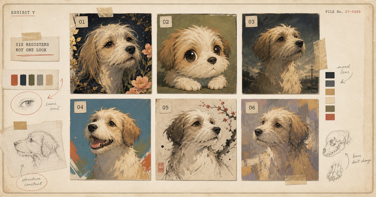
Ask someone to describe “shōnen anime” and most will describe a genre: a teenage boy, a training arc, an attack he yells before he throws it. That is not what the word means. Shōnen means boy. It is a demographic label, the aisle a manga magazine got shelved in, not a description of how anything is drawn. Shōjo means girl. Seinen and josei are the adult versions, aimed loosely at men and women from their late teens up. None of the four tells you anything about linework, color, or pacing. A shōnen title and a shōjo title can come out of the same demographic system with wildly different visual conventions and still get filed under the same publishing label. Two seinen titles, printed for the same adult readership, can look like they were made on different planets.
The Boys’ Shelf and the Girls’ Shelf
Japan’s first magazine aimed specifically at a young readership was Shōnen Sekai, launched in 1895. Girls got their own dedicated magazines by 1902. Shōnen Pakku, in 1907, became the first boys’ magazine to run manga inside it. Shōnen Club followed in 1914. Weekly Shōnen Jump, still the best-selling manga magazine in the world, launched in 1968. Every one of those launches was a business decision about who buys the magazine off the newsstand, made by a publisher, not an art director. The shōnen demographic itself runs roughly age ten to nineteen, but the actual readership extends well past that into adults of every gender, and the genre content inside it spans action, comedy, romance, sports, and slice of life without any of those categories requiring a particular drawing style.
So when a customer tells an artist they want their dog painted “shōnen style,” the artist has learned almost nothing about what the finished piece should look like. What they have learned is which magazine, hypothetically, this dog’s biography would have run in. A shōnen title and a shōjo title can share a studio and a character designer and look nearly identical. Two seinen titles, printed for the same audience, can look like they belong to different mediums. The demographic tells you who the publisher expected to buy the magazine. It does not tell you whether the art uses screentone dot patterns or painterly gradients, rounded proportions or naturalistic ones, black and white manga panels or six-figure digital compositing.
The Decorative Register Has a Paper Trail
The look most people actually picture when they say “anime,” the enormous eyes with star-shaped highlights, cascading lashes, panels that dissolve into scatters of drawn flowers, is a specific, traceable lineage, and it predates manga as a medium. Pre-war illustrators Yumeji Takehisa and Jun’ichi Nakahara were already drawing girls with large, glowing eyes for illustrated girls’ magazines before the Second World War. The artist historians credit with bringing that eye style specifically into manga is Macoto Takahashi, in the late 1950s. Two decades later, a circle of women manga artists working in overlapping social and professional circles, historians now call them the Year 24 Group, Moto Hagio, Keiko Takemiya, and Yumiko Ōshima among them, pushed the technique further: finer linework, and panels that stopped behaving like boxes. A character’s hair could spill across the gutter into the next panel. A pair of eyes could take up a third of a page, bordered by nothing but drawn flowers instead of a frame.
That decorative, emotionally saturated register, not any of the boy-genre trappings people assume come with the word “anime,” is what most Western viewers actually picture first. It came out of magazines built for girls, and it has nothing to do with the demographic word shōnen at all.
The Squashed Register Built an Empire Out of Capsule Toys
Take the same face and crush its proportions down. A standard anime character runs seven to eight heads tall, the same ratio illustrators use for anatomically realistic figures. Shrink that to two heads, inflate the eyes, stub the limbs, and round everything off, and you get chibi, also called super deformed or SD: a super-deformed head alone can take up a third to half of the character’s total height. The word chibi comes from Japanese slang for a small child, tracing to chibiru, to wear down. Super deformed borrows the French déformer by way of the Japanese deforume.
The style has an origin story with a name attached to it. In the mid-1980s, a fan named Koji Yokoi sent super-deformed drawings of Gundam mecha to Bandai’s hobby magazine, Mokei Jōhō. The editor liked them enough to commission serialized four-panel comics, which put Yokoi in contact with Bandai’s capsule-toy division. In 1985, Bandai launched the Gashapon Senshi Series: SD Gundam World, roughly hundred-yen PVC figures sold out of capsule-toy vending machines, aimed at grade-school kids who had zero interest in the franchise’s serious mecha-war plotting. It sold enormously well. A decade later, Sailor Moon’s Chibi Usa, the heroine’s small, pink-haired future daughter, carried the word itself into wide American circulation. By the time American fans were saying “chibi,” the style had already been running a toy business in Japan for ten years.
The Same Word Covers Four Different Decades
“Anime” also means whatever decade a viewer grew up watching it in, and those decades do not look alike. The late-1980s OVA look, direct-to-video releases like Bubblegum Crisis (Artmic and AIC, 1987 to 1991), is grainy analog cel work with high-contrast neon lighting, cyberpunk before the aesthetic had a settled name in the West. The 1990s prestige register is a different animal entirely. Ghost in the Shell (Production I.G, 1995, directed by Mamoru Oshii) blends traditional cel animation with some of the earliest CGI compositing used in a theatrical release, and Cowboy Bebop (Sunrise, 1998, character designs by Toshihiro Kawamoto) runs a muted, jazz-scored palette that looks nothing like the neon OVA era just a decade earlier. Studio Ghibli, founded June 15, 1985 by Hayao Miyazaki, Isao Takahata, and Toshio Suzuki, built its own house style around watercolor backgrounds and soft, hand-inked linework, visible in My Neighbor Totoro (1988) and every Ghibli film since. And the current era leans on digital compositing to do what none of the earlier decades could afford: Demon Slayer (Ufotable, first season 2019) layers painted-looking effects animation, fire, water, light, over otherwise conventional cel character work, at a density that would have blown a 1990s television budget in one episode.
Four decades, four visual grammars, one loanword covering all of them. Anime is simply the Japanese abbreviation of the English word animation. English speakers narrowed it down to mean one specific look, then kept narrowing it decade by decade, without noticing the look kept changing underneath the label.
What to Actually Say
None of this is trivia for its own sake. “Anime style” is not enough information to hand an artist, in the same way “European style” is not enough information for a house painter. Do you mean the decorative shōjo register, all lash and light? The squashed, toylike chibi proportions? The muted 1990s cinematic palette, or the effects-heavy compositing of the last five years?
Pet on Canvas’s anime style leans toward that later, cinematic register: crisp linework, layered cel shading, and a background that carries mood rather than clutter, while keeping your pet’s actual markings and expression the recognizable center of it. If you already have a reference in mind, whether it is a specific film’s lighting or a specific decade’s grain, naming it in your order notes does more work than the single word “anime” ever will. The style comparison page walks through how anime sits next to the studio’s other five styles if you are still deciding. And if what you are actually picturing is not a dramatic pose at all but your cat just sitting there, doing nothing in particular, there is a whole other register built for exactly that, covered in a separate post.
The word survived by getting vaguer, not more precise. Most loanwords narrow as they travel. This one widened, then got asked to do the job of six separate visual histories at once, and mostly nobody noticed the strain until they had to order a portrait and explain, out loud, which decade they actually meant.
Sources
Welcome perk
Free expedited delivery on your first portrait
Get your digital proof in 1-2 business days instead of 2-3, free on your first portrait. Normally a $10 upgrade.
No spam. Just the perk and the occasional new style or guide.
Check your inbox for your code.