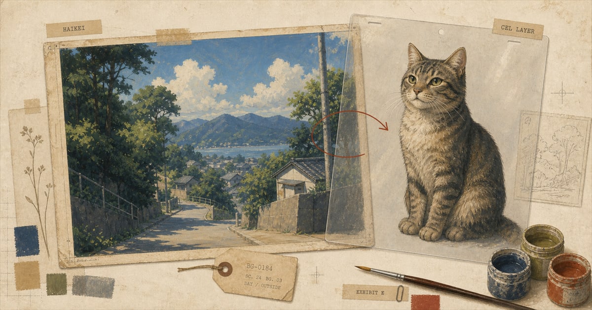
Watch a scene from My Neighbor Totoro: Satsuki and Mei running through a meadow, rain falling on volcanic soil, wind moving through grass at the edge of a rice field. The natural assumption is that whoever drew the girls also painted the ground under their feet. Nobody drew a line to mark where one artist’s work stopped and another’s started, and that is exactly the point. The meadow was painted by a different department, in a different medium, by a person the two girls never meet and the credits rarely get you to notice: while the characters were inked and colored as cels, the ground under them was painted in poster color on board, by an artist working from a wet brush with a window of thirty to sixty minutes before the paper dried out from under him.
A Department With Its Own Name and Its Own Paint
Japanese animation studios have a specific title for the person running that department: bijutsu kantoku, the art director, credited separately from the animation director and rarely the same person. Most studios do not keep a background department in house at all; the work is often contracted out to companies that specialize in nothing else.
At Studio Ghibli, the job belonged for years to a man named Kazuo Oga, born February 29, 1952, in Akita Prefecture, who joined the studio in 1988 as background art director for My Neighbor Totoro. He held the same role on Kiki’s Delivery Service, Only Yesterday, Pom Poko, and Princess Mononoke, painted backgrounds without the director title on Porco Rosso, Spirited Away, The Cat Returns, and Howl’s Moving Castle, and was art director again on The Tale of Princess Kaguya. He left Ghibli’s staff in 1994 and kept working with the studio as a freelancer for decades afterward. He was not the only one. Nizō Yamamoto, born in 1953 in Nagasaki Prefecture, entered the industry in 1974 after watching NHK’s Heidi, Girl of the Alps, worked with Hayao Miyazaki on Future Boy Conan and with Isao Takahata on Anne of Green Gables, and was invited into Ghibli at its founding in 1985. His background work carried through Laputa: Castle in the Sky, Grave of the Fireflies, Whisper of the Heart, Princess Mononoke, and Spirited Away, before he left to found his own studio and died in August 2023 at 70. Two different men, two overlapping careers, one department, doing work that almost nobody watching the finished film could name.
Thirty Minutes Before the Paper Dries
Oga worked in Nicker poster color, a commercial gouache sold in ordinary art shops, mixing from around twenty-one colors onto 400-pound TMK poster paper, using Japanese flat brushes for coverage and fine-pointed Sakuyo brushes for detail. His method ran in two stages. First came ji-nuri, a base coat laid down while the paper was still wet, which had to be finished within thirty to sixty minutes or the paper would dry and the wash would stop behaving the way he needed it to. Only after that could the detail work start: grass blades, wood grain, the texture of wet stone. He also preferred visiting real locations over working from photographs alone, which is a specific, unglamorous kind of research. Stand in a real field in Japan, decide how much of it belongs in the frame, and then have less than an hour to commit the first layer of paint before the material stops cooperating.
An Argument About Dirt
The disagreements that came out of that process are small and specific enough to be worth knowing. On Totoro, Oga and director Hayao Miyazaki argued over the color of the soil. Oga wanted to paint the black volcanic soil of his native Akita Prefecture, the ground he had actually grown up standing on. Miyazaki wanted the red-brown soil of the Kantō region, where Tokyo sits and where the film is set. The finished compromise has been described as nature painted with translucent colors, but the argument itself is the more useful detail: two people who both knew exactly what real Japanese dirt looks like, disagreeing about which real dirt belonged in a fictional meadow. Oga described his own job plainly, saying that backgrounds are not solely the creation of the artist who painted them. A colleague, Naoya Tanaka, described it differently: Oga was good at extracting and augmenting pieces of a real place to produce, in the finished painting, a deliberate sense of déjà vu.
Why the Seam Reads as Depth Instead of a Mistake
There is an academic argument for why none of this reads as an error. Media theorist Thomas Lamarre, in his 2009 book The Anime Machine: A Media Theory of Animation, argues that anime’s look comes from treating the image as layered planes, background, midground, and foreground, that are allowed to differ from each other in color and level of detail and that can move independently of one another. Lamarre calls the effect animetism, and offers an analogy for how it differs from the way live-action film usually fakes depth: cinema is like looking from the front of a moving train, tracking forward toward a vanishing point, while anime’s layered planes are like looking out the side window, watching the foreground rush past while the background drifts more slowly behind it. Lamarre traces the idea back to the multiplane camera Disney invented for exactly this purpose, technology Miyazaki used directly on Laputa: Castle in the Sky. The different medium and the different hand behind the background are not a flaw the audience tolerates. They are the mechanism producing the depth the audience is seeing.
Hand Painting Lasted Longer Than You’d Guess
It is tempting to assume this is an old, pre-digital story, something that stopped mattering once studios moved to computers. It did not stop nearly as early as most people think. Sazae-san, the long-running, thoroughly mainstream Japanese family sitcom, was the last major animated production to abandon physical cel animation entirely, hand-painting cels until September 29, 2013. Satoshi Kon’s Millennium Actress, from 2001, is generally cited as the last major feature film made with fully traditional ink-and-paint. Long after most viewers assumed animation had gone digital, someone somewhere was still mixing poster color by hand and racing a clock before the paper dried.
The Background Is a Second Decision, Not a Default
The background is a choice, made deliberately by a second artist in a second medium, doing a job the character art up front was never going to do on its own. It sets weather, distance, season, and mood, all without competing with the face in front of it for attention.
That is worth carrying into a decision most people treat as an afterthought: what goes behind your pet in a portrait. A custom pet portrait usually gets far more thought put into the animal than the space around it, which is backwards from how the professionals who do this for a living actually work. A plain wash of color keeps every ounce of attention on the pet. A real place, the specific window they sleep in, the actual park bench, the color of a familiar hallway, does a different job. It turns the portrait into a scene instead of a specimen. Neither choice is automatically correct. Both are real decisions, the same kind Kazuo Oga and Hayao Miyazaki were arguing about when they disagreed over the color of fictional dirt.
Anime is one of six art styles available for a custom portrait now, and it is worth deciding on purpose what the background behind your pet is doing, rather than defaulting to whatever happened to be behind them in the reference photo. How the process actually works covers how much of that decision is yours to make; the portfolio has examples of both approaches sitting next to each other, if you want to see the difference before deciding which one is yours.
Sources
- Kazuo Oga, GhibliWiki.
- Animation Obsessive, “What Kazuo Oga Thinks About When He Thinks About Backgrounds.”
- Nizō Yamamoto, GhibliWiki.
- Animation Magazine, “Ghibli Art Director Nizô Yamamoto Dies Age 70.”
- The Anime Machine, Wikipedia.
- Digital ink and paint, Wikipedia.
Welcome perk
Free expedited delivery on your first portrait
Get your digital proof in 1-2 business days instead of 2-3, free on your first portrait. Normally a $10 upgrade.
No spam. Just the perk and the occasional new style or guide.
Check your inbox for your code.