
On 16 January 1957, the artist Richard Hamilton sent a letter to the architects Peter and Alison Smithson that did more to define pop art than any single painting has managed since. In it he listed the qualities he thought the new style was reaching for: Popular, Transient, Expendable, Low cost, Mass produced, Young, Witty, Sexy, Gimmicky, Glamorous, Big Business. Read that list again, slowly. Nothing in it says individual. Nothing says permanent, or irreplaceable, or one of a kind. By the account of the person usually credited with naming the movement, pop art was built to describe the opposite of those words, on purpose.
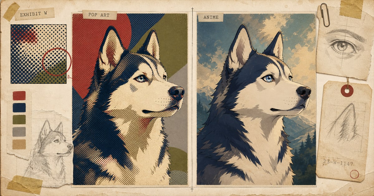
That matters here because pop art and anime get filed together more often than the evidence supports: both loud, both saturated, both instantly readable as “a style” rather than a plain rendering. People treat them as two flavors of the same boldness. They are not. One tradition was founded to celebrate reproducibility. The other spent decades building a visual grammar for holding one face still and making that stillness carry a story. Point either one at a portrait of your actual, specific, non-replaceable pet, and they pull in close to opposite directions.
A letter that reads like an ad brief, not a manifesto
Hamilton wasn’t writing for publication. He was writing to friends, describing what he saw happening in British and American commercial culture, and his list reads less like art theory and more like a client brief from an advertising agency, the kind of thing a copywriter might pin above a desk. That detail matters, because it tells you where pop art’s founders thought the movement’s power actually lived. Not in permanence. In disposability: in the fact that an advertisement, a candy wrapper, or a soup label was made to be looked at once and thrown away, and somebody decided that was worth hanging on a wall instead.
A year earlier, in 1956, Hamilton had already put the idea into a physical object: a small collage called Just What Is It That Makes Today’s Homes So Different, So Appealing?, made for the catalogue and promotional poster of the This Is Tomorrow exhibition at London’s Whitechapel Gallery. It shows a bodybuilder holding an oversized Tootsie Pop like a barbell, a woman in a lampshade hat, a vacuum cleaner, a canned ham hanging on the wall like a painting, all cut from American magazines and pasted into one small room. It’s now considered one of the earliest pop art works, and it was made, fittingly, as advertising for a show: an object designed to be handed out and discarded, long before anyone called it important.
What Warhol actually did in 1962, and what he didn’t
Andy Warhol is the name most people reach for when the subject is pop art and mass production, and the reach is correct, though the details usually get scrambled. The common version has Warhol silkscreening his 1962 Campbell’s Soup Cans, 32 canvases, one for every variety Campbell’s sold that year, stamped out mechanically like the cans themselves. That isn’t what happened. The original 32 canvases were hand-painted and traced, with a handful of details, like the gold fleur-de-lis on each label, stamped on rather than painted freehand. Warhol had learned the silkscreen technique the year before, in 1961, from Floriano Vecchi at Tiber Press, and he leaned on it heavily afterward, most famously for the Marilyn Monroe portraits he began making after her death in August 1962. The soup cans came just before that shift.
None of that weakens the piece’s point about reproduction. If anything it sharpens it. Warhol sat and hand-painted the same can, in the same format, thirty-two separate times, less like an artist chasing variation and more like a worker doing a shift on a line. When the paintings debuted at the Ferus Gallery in Los Angeles on July 9, 1962, they were displayed on narrow shelf-like ledges, arranged the way cans sit in a grocery aisle. Almost nothing sold at first. The dealer Irving Blum eventually bought the whole unsold set on a payment plan. The Museum of Modern Art acquired the complete set of 32 canvases in October 1996, on a different kind of shelf entirely.
Two different flatnesses, two different bills
It’s worth pausing on why both styles look flat in the first place, because the flatness in each case comes from a separate production history that happened to land on a similar surface. Comic-book printers in the 19th century couldn’t afford full-color runs, so a printer named Benjamin Henry Day Jr. patented a process in 1879 that faked extra shading with small dots of ink, a trick that became standard in mainstream color comics and that Roy Lichtenstein later blew up to gallery scale on purpose. Anime’s flatness has an entirely separate bill behind it. Traditional animation was painted onto transparent celluloid sheets called cels, a process patented by Earl Hurd in 1914, and a single feature film could run past 100,000 individually hand-painted cels. Studios that couldn’t afford to move a picture smoothly held it still instead, and cel shading, the flat, hard-edged coloring now associated with anime portraits, is a digital-era echo of that exact constraint. Pop art’s flatness is a printing economy wearing a costume. Anime’s flatness is an animation economy wearing a different one. They resemble each other. They were never paying the same bill. The fuller detour into Lichtenstein’s dots and Warhol’s repeating grids lives in an earlier post on this site, worth reading if the mechanics of pop art specifically are what you’re after.
Where the two lines actually cross: Murakami’s Superflat
The two styles aren’t just distant cousins gesturing at each other across an ocean. There’s a documented, named meeting point, and it happened in 2000, when the Japanese artist Takashi Murakami curated an exhibition called Superflat and wrote its catalogue essay. It was first shown at the Museum of Contemporary Art, Los Angeles, at its Pacific Design Center location, before traveling to the Walker Art Center in Minneapolis and the Henry Art Gallery in Seattle. Murakami’s argument traces a flat, two-dimensional pictorial tradition running from Edo-period Japanese painting through ukiyo-e woodblock prints into contemporary anime and manga, drawing on art historian Nobuo Tsuji’s research into Edo-period painters and citing Hokusai’s Thunderstorm Beneath the Summit, painted around 1830 to 1832, as an ancestor of the flat picture plane he identifies in anime. He also used “superflat” to describe something close to Hamilton’s own definition of pop art, aimed at a different country: the erosion of the line between fine art and commercial, consumer-facing culture, in Murakami’s case postwar Japanese advertising, toys, and animation rather than American soup labels and movie posters.
Wikipedia’s own general entry on pop art, not a page written about Murakami specifically, states the connection plainly: “manga and anime also influenced later pop artists such as Takashi Murakami and his superflat movement.” Murakami has been nicknamed the Warhol of Japan often enough that the comparison shows up in coverage that has nothing to do with fine art, including his design work for a major hip-hop album cover. The nickname holds up for a specific reason. Murakami took anime and manga, forms built to flatten toward character and narrative, and did to them exactly what Warhol did to soup cans and movie stars: repeated them, multiplied them, put them in a gallery, and asked whether the wall still cared about the difference between commerce and art. The two vocabularies didn’t just resemble each other from a distance. One artist stood directly in the overlap and named it.
So which one is actually bold
Both are loud. Loud isn’t the same job twice. Pop art is bold about erasing the individual: repeat the image, flatten the color, treat the subject as interchangeable with any other can on the same shelf, and let that interchangeability be the point, even the joke. Hamilton’s own list gives away the plan: popular, transient, expendable, mass produced. A pop art portrait borrows that grammar and points it at your specific dog or cat, which is genuinely funny, since a pet is about the least expendable, least mass-produced subject most people will ever commission art of. The style works as a portrait precisely because of that mismatch, not despite it.
Anime is bold in the opposite direction. It’s a medium that spent decades unable to afford continuous movement and built, out of that limitation, a visual language for holding one face still and making the stillness carry weight: big eyes, deliberate linework, a held pose doing the job a moving frame does elsewhere. Applied to a pet, that grammar doesn’t say interchangeable icon. It says specific character in an ongoing story, which happens to be closer to how most people already think about the animal asleep on their couch.
Neither style is more serious than the other, and neither is automatically the better fit for a given pet. The style comparison guide covers which coats and personalities suit which look in practical terms. But it’s worth knowing, before choosing between them, that bold was never one thing. One tradition got loud by insisting nothing on the shelf is special. The other got loud by insisting the one face on screen is the only thing that matters for as long as it holds still. Murakami spent an essay proving the two traditions share an ancestor. He never claimed they were making the same argument, and on the evidence, they aren’t.
Sources
Welcome perk
Free expedited delivery on your first portrait
Get your digital proof in 1-2 business days instead of 2-3, free on your first portrait. Normally a $10 upgrade.
No spam. Just the perk and the occasional new style or guide.
Check your inbox for your code.