
Put a Soviet eye-tracking rig on a person in 1967 and ask them to look at a photograph of a face. Aleksei Yarbus did exactly that, and what he recorded was not a random scatter of glances. It was a loop. The gaze went to the eyes, then the nose, then the mouth, back to the eyes, around again, in a repeating triangle, with a clear and consistent preference for the eyes over any other single feature on the face. It remains one of the most replicated findings in vision science, cited in textbook after textbook nearly sixty years later. Before anyone drew a single manga panel with saucer-sized irises, human attention already worked this way.
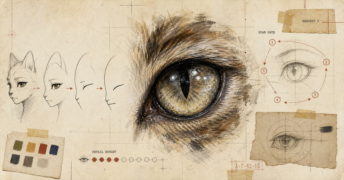
That fact turns out to explain something about anime faces that “the artists just like drawing eyes” doesn’t. Look at almost any anime character and the imbalance is obvious: a nose reduced to a dash or a soft curve, a mouth that’s little more than a line until it needs to open, and then, sitting in the middle of all that near-blankness, an eye built from four or five distinct layers of ink and color. The imbalance isn’t a mistake or a stylistic tic. It’s a face drawn to match where a viewer’s attention was already going to land.
That economy is not new. The whole medium learned to cut corners on a 1963 television budget, and the mouth and nose are two of the places the corner-cutting stuck. The eyes are the one place it never did.
The Convention, Not the Rule
Before going further, it’s worth being honest about what part of this claim actually holds up and what part is closer to folklore. It is genuinely true, and easy to verify by looking at almost any character sheet, that anime eyes are typically constructed in visible layers: a base shape, an iris, two highlight shapes of different sizes catching different light sources, ink cleanup, and a color gradient. That’s simply more visual information than goes into the two lines that make a nose. What is not true, and what gets stated as fact more often than it should be, is that any named studio, animator, or production document has described this as a deliberate policy: allocate more drawing time to the eyes because that’s where attention goes. No interview, no production record, no scholarly source turns up saying that in so many words. The layered-eye convention is real. The idea that a studio wrote it down as strategy is not something anyone can currently point to.
The bigger problem with treating this as a universal law is even simpler: it isn’t one. Studio Ghibli is the standing counterexample, and it’s not a small one. Hayao Miyazaki’s character designs are known specifically for realistically proportioned eyes and natural hair color, a deliberate departure from the exaggerated-eye convention that shows up everywhere else in the medium. Anime is not one visual style wearing different outfits. It’s a medium that spans an enormous range, and the giant eyes belong to specific traditions within it, most visibly the shonen and shojo lineages, not to anime as a category. Any version of this argument that claims otherwise is flattening a medium that includes its own most famous internal exception.
So the honest question isn’t “why does anime always do this.” It’s “why does this particular, widespread, non-universal convention work as well as it does on a viewer, when a studio commits to it.” That question has a real answer, and it comes from comics theory and attention research, not from an industry memo nobody can produce.
A Blank Face Is Easier to Wear
In 1993, the cartoonist and theorist Scott McCloud published Understanding Comics, and on page 31 he made an argument that anime’s simplified faces run on directly, even though he wasn’t writing about anime specifically. The more simplified, or “iconic,” a drawn face becomes, McCloud argued, the more different individual people it can represent to a viewer. A photorealistic face is unmistakably one specific person. A face reduced to a few essential lines is closer to a symbol, and symbols are easier to project yourself into.
A few pages later, on 42 through 44, McCloud names the mechanism directly: masking. Take a simply drawn, iconic character and place it against a more realistically rendered world, or next to more detailed side characters, and the reader tends to experience the simple character as a kind of blank mask they can occupy, while the detailed elements around it stay experienced as belonging to someone or something else. McCloud specifically points to Japanese comics as an example of this technique in action. It’s a strange kind of asymmetry to build a whole visual grammar on: the less specific a face is, the more it can feel like yours.
That’s the actual function of the blank nose and the almost-nonexistent mouth. It isn’t that the artist ran out of interest partway through the face. The simplicity is what lets a reader step into the character rather than just observe one. And it explains why the eyes don’t get simplified along with everything else. If the rest of the face is a mask a reader can wear, the eyes are the one feature doing the opposite job: making eye contact, holding expression, being specific enough to seem alive while the mask around them stays open. A face that was detailed everywhere would be a portrait of somebody else. A face that was blank everywhere, eyes included, would be a mask with nothing behind it. The layered eye sitting inside the empty mask is what makes the mask worth putting on.
Where the Convention Actually Came From
The large-eye style itself has a traceable, specific origin, and it has nothing to do with attention research, because Osamu Tezuka wasn’t running experiments in 1946. He drew on Western sources directly: the exaggerated, sparkling eyes of performers in the all-female Takarazuka Revue theater troupe, and American cartoon figures like Betty Boop and Mickey Mouse. Some historians of the medium, including the scholar William Tsutsui, have offered a second explanation running alongside Tezuka’s personal taste: postwar Japanese character design moved toward large, deliberately ambiguous features partly to distance new imagery from the racial caricature that had defined wartime propaganda art. That’s a cultural and historical argument, not a biological one, and it’s worth knowing precisely because it means the convention has more than one origin story, and none of those origin stories require a theory about attention at all. The convention arrived first. The explanation for why it works on a viewer came later, and from a different field entirely.
Put the pieces together and you get something more interesting than “eyes are important, so anime draws them big.” A viewer’s gaze already loops toward the eyes before any pen touches paper. A simplified face invites the viewer to occupy it rather than just watch it. And an eye rendered in visible, careful layers gives that occupied face something specific enough to feel looked back at. None of that requires a studio memo about rendering budgets. It just requires a face built by people who, whether they’d read Yarbus or not, understood exactly where a viewer’s eyes were going to go.
There’s a related, separate case to be made about why big eyes specifically read as endearing rather than just noticeable, which is a question about baby-faced proportions and dog eyebrows more than it is a question about attention and abstraction. That’s its own article. This one is about the mechanism of looking, not the reason the look reads as cute.
If you’re deciding whether the anime style is right for a portrait of your own pet, it’s worth knowing what you’re actually asking for: a face simplified enough to feel immediate, with the eyes carrying nearly all of the specific detail. You can compare it against the studio’s other options on the style guide.
Sources
- Yarbus, Eye Movements, and Vision (i-Perception, discussion of the 1967 original)
- The Anime Machine: A Media Theory of Animation, Thomas Lamarre, University of Minnesota Press, 2009.
- Masking (comics), overview with McCloud citations
- Anime, art style overview including the Studio Ghibli counterexample
- Osamu Tezuka, background on Disney and Takarazuka Revue influence
Welcome perk
Free expedited delivery on your first portrait
Get your digital proof in 1-2 business days instead of 2-3, free on your first portrait. Normally a $10 upgrade.
No spam. Just the perk and the occasional new style or guide.
Check your inbox for your code.