
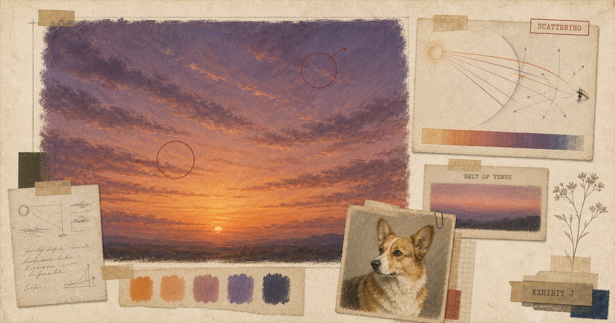
A sunset sky is not one color fading into another. It’s two different physical events happening in two different parts of the same sky at the same time, and anime’s habit of running orange into purple across a single frame is closer to a weather report than an invented style choice.
Two unrelated things are happening in the same sky
Point a camera at the horizon where the sun just went down, and the color you’re seeing is ordinary Rayleigh scattering doing something extra. Sunlight travels through far more atmosphere at a low angle than it does at noon, and the shorter wavelengths, the blues and violets, scatter out of the direct beam long before they reach your eye. Violet light scatters roughly 625 times more strongly than red light does under the same conditions, which is also why the daytime sky is blue in the first place: same physics, different angle. At sunset, what survives the trip is weighted toward orange and red, the color sitting low on the horizon in nearly every sunset photo ever taken.
Turn around, though, and look at the part of the sky directly opposite the sun, and a second, unrelated phenomenon is doing something different. It’s called the Belt of Venus: a band of pink to purple, usually 10 to 20 degrees above the horizon, caused by that same reddened sunlight scattering backward off atmospheric particles instead of forward into your eyes. Underneath it sits a darker band called the twilight wedge, which isn’t fog or haze. It’s the Earth’s own shadow, projected onto its own atmosphere. The Belt of Venus tends to look more vivid in winter, when lower humidity gives it less to scatter off of. Orange at the horizon and purple opposite it aren’t the same event stretched across the sky. They’re two separate phenomena that happen to be visible at once, for the length of one twilight.
The convention we went looking for and couldn’t confirm
It would be satisfying to report that some named colorist at a specific studio wrote this palette down as a rule: orange low, purple high, every sunset, forever. That specific claim doesn’t hold up under an actual search. There’s no credited “color design” glossary entry, no named industry standard, spelling out an orange-and-purple sunset convention the way there’s a documented standard for, say, key animation timing. What holds up instead is simpler and more interesting: the palette anime reaches for by habit is also the palette a real sky produces by physics, so the “convention” and the weather report were never two different things that needed reconciling.
That’s a familiar shape for this kind of question. The genetics behind a merle or brindle coat turned out to be real and specific too, once someone actually looked. This is the same kind of case, just with weather instead of DNA.
Worth separating this from something it superficially resembles: “teal and orange,” the color-grading trend in live-action film and television, where shadows get pushed toward blue-teal and skin tones get pushed toward orange to widen the contrast between a subject and its background. That’s a real, well-documented habit in digital color grading, and it solves a different problem than a sunset does. A sunset isn’t grading a subject against a background. It’s two unrelated pieces of atmosphere doing two different things at once, with nobody choosing anything. Anime’s sunset palette doesn’t need to borrow credibility from a live-action editing trend to make sense. The sky was doing this before either medium had a name for it.
Photographers have their own name for the light in this window: golden hour, sometimes magic hour, the period right around sunrise or sunset when color temperature drops from about 5,500 kelvin at midday to roughly 3,500 kelvin during golden hour proper, and closer to 2,000 kelvin at the moment of sunset itself. Anime dialogue has its own name too. In Makoto Shinkai’s Your Name (2016), the word is kataware-doki, an old term for the moment at dusk when it gets hard to tell one person from another in the fading light. The film says “magic hour” out loud in translation and then treats that window as the specific hinge point when its two leads can meet across time. Nobody needed to invent a rule for what dusk looks like. Dusk already came with one, and Shinkai gave it a name that let the plot use it.
Paint used to have an excuse. Digital doesn’t.
There’s an obvious alternate explanation worth taking seriously before setting it aside: maybe the palette used to be genuinely limited by whatever paints a studio had mixed and shelved, the same way a print workshop was limited by whatever pigments existed that year. That explanation has a shelf life, and it’s shorter than most people assume. Satoshi Kon’s Millennium Actress, released in 2001, is generally cited as the last major feature to use fully traditional ink-and-paint animation from start to finish. The long-running television series Sazae-san held onto physical cels even longer, all the way until September 29, 2013. Physical cel paint came in a fixed, pre-mixed set of colors, chosen in advance and reused across an entire production because remixing a shade mid-series was expensive and risked not matching. Digital color erased that constraint. Once a production could call up any hue at any saturation with a slider, there was no shelf of paint left to blame.
If a limited palette had been the real reason skies kept landing on orange and purple, digital color should have loosened it, the way it loosened everything else about how anime gets colored. It didn’t, not in any documented, dated break with the older look. That absence is itself a small piece of evidence. The sky kept reading the same way after the excuse disappeared, because the excuse was never the reason. The sky looks like that because that is what a sky looks like.
One director who kept the sky for himself
Most credited color design work on an anime film goes to someone other than the director. Shinkai is the exception worth naming, because he kept that credit for himself, repeatedly, across more than a decade. He’s credited for color design on 5 Centimeters per Second in 2007, on Your Name in 2016, and on Weathering with You in 2019, all three alongside directing. On 5 Centimeters per Second, the background paintings themselves were the separate work of two named artists, Takumi Tanji and Ryoko Majima, with Takayo Nishimura as character designer. That division makes Shinkai’s own color-design credit a deliberate choice rather than a default. Someone else painted the backgrounds. He still decided what they’d be lit like.
That’s not how a large studio production usually splits the work, and it’s a large part of why a Shinkai sky reads as a signature rather than a genre habit. Weathering with You had its own credited cinematographer, Ryōsuke Tsuda, its own art director, Hiroshi Takiguchi, and its own animation director, Atsushi Tamura. Shinkai kept color design anyway, on top of directing, writing, and editing. When someone says a sky “looks like anime,” what they usually mean, without knowing it, is that it looks like a sky one specific person decided not to hand off.
What the sky owes the plot
Shinkai has talked about using both CG and hand-drawn animation together to get Weathering with You’s rain right, and about drawing on Japan’s actual rise in summer rainfall as inspiration for the film’s weather. That’s the opposite instinct from treating a sunset as decoration. Kataware-doki isn’t background color behind a scene. It’s the reason the scene can happen at all, which is a heavier job than most skies in most films are asked to do.
None of this makes the orange-purple sky an anime invention, and it was never going to be one. It makes it a genre borrowing something true, then, in at least one director’s case, refusing to hand off the part that made it work. An anime-style portrait of your own pet runs into the same small decision every one of those skies did: what to do with the light once the subject in front of it is settled. The studio’s portfolio has plenty of examples, none of them Shinkai’s, all of them making that same call on a much smaller canvas. The sky, it turns out, was never the trick.
Sources
Welcome perk
Free expedited delivery on your first portrait
Get your digital proof in 1-2 business days instead of 2-3, free on your first portrait. Normally a $10 upgrade.
No spam. Just the perk and the occasional new style or guide.
Check your inbox for your code.